Ten reasons we switched from an icon font to SVG
A Lonely Planet project
Posted on | Comments
We use a lot of icons on lonelyplanet.com and recently went through the task of transferring them from an icon font to SVG files. I wanted to share why we did this along with some of the drawbacks to SVG and how we got around them.
1. Separation of concerns
We use a custom font on lonelyplanet.com and we used to bundle the icons into the same file, storing the glyphs within the Private Unicode Area. This was great because it meant one less HTTP request to fetch the icons but we also felt that it limited our flexibility in how we prioritised resource loading.
We don't consider our font to be critical to the user's experience and only a small subset of our icons are actually deemed critical. We try to load non-critical assets after the page content and this was something we weren't able to do previously.
Breaking the critical icons out from the font and the rest of the icons allowed us to be more granular in how we delivered them to the user.
Counter argument
"You don't have to bundle the font and the font icons together, you could serve two separate fonts."
We could do this instead and it's something we probably would have done had we stuck with the font-face solution.
2. Some devices don't honour the Private Unicode Area
I'd heard rumours about devices overriding glyphs in the private unicode area and using them to serve emoji but I hadn't seen it happen until recently. Emoji was historically stored in the private unicode area, but at different ranges, so it would make sense that there could be conflicts.
I can't remember which device I was testing on but I saw one of our tick icons replaced with a multi-colour printer. The page looked amateurish and broken and certainly gave us impetus to make this transition.
Edit 28 September 2014
There is an example of this, alongside some other excellent points, over at css-tricks.
Chris Coyier also collated an incredible compendium of SVG knowledge, A Compendium of SVG Information which should be the default place to go for svg information.
3. Black squares and crosses on opera mini
Font face support and detection is historically quite tricky to get right. I'm sure you've all seen this image of font awesome rendering on opera mini:
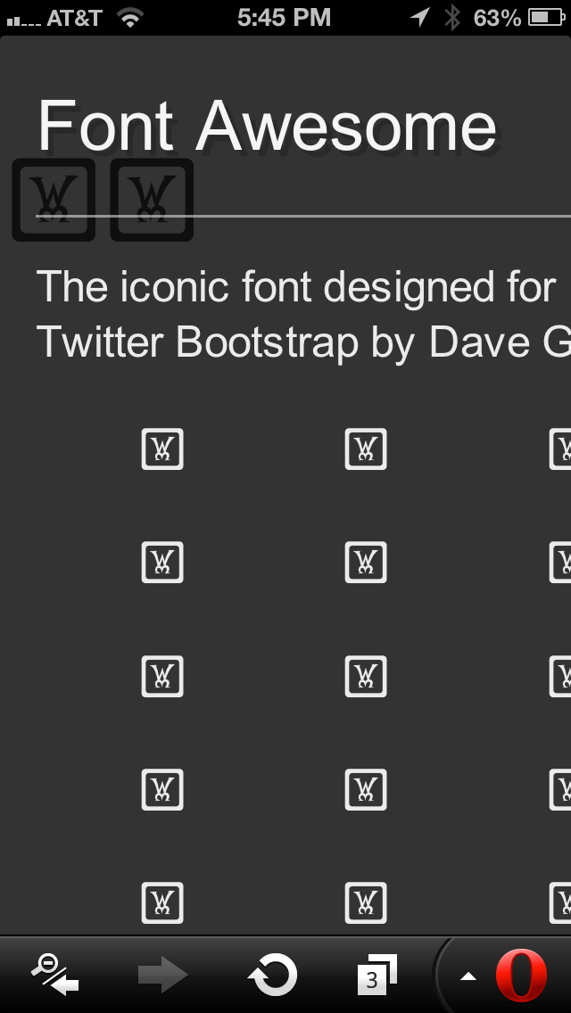
I won't go over the intricacies of this problem as Opera Mini support and many other platforms have been covered very well in this article by @kaelig. I think what is really important though, beyond Opera Mini, is that this highlights a blind spot that we're not able to control. We can't test on every device so we should use techniques that are more likely to render consistently.
We don't get a huge amount of traffic from Opera Mini at the moment but we're a travel company serving people in all conditions on all bandwidths so we want to do better than that. With SVG and PNG we feel more confident that users won't get a broken and confusing page.
4. Chrome support for font-icons has been terrible recently
Chrome Canary and Beta were hit with a fairly horrible font bug recently. If you haven't yet noticed the bug, fonts have been unloading and reverting to a system font after the page has experienced a period of inactivity.
When a font unloads and you're left with the text served as Georgia it can be a little annoying. The page is still very usable though. If the same font is responsible for serving the icons then suddenly the page is littered with black squares and looks broken.
This bug was introduced during our transition to SVG. It was a relief to cut over just as we were starting to get our first bug reports about it.
Counter argument
Those bugs haven't made it to a stable build of Chrome.
Edit 28 September 2014
These bugs did make it to stable, but have long since been fixed.
5. Crisper icons in Firefox
We've found that our font renders at a slightly stronger weight in Firefox than in other browsers. This is ok for text (although not great) but for icons it can make the entire page look a bit unloved and clumsy. By using SVG we are able to normalise the look and feel of our icons cross browser.
Edit 28 September 2014
Font weights can be normalised by applying -moz-osx-font-smoothing: grayscale;
6. You don't always have to use generated content.
If you want to use font-icons in css you need to declare them using the content property in generated content. Sometimes you might find yourself having to complicate your code to make this possible i.e. because you are already using the :before and :after pseudo elements on the element or because the element doesn't support generated content.
In that case you could choose to render it inline but you then end up with html entities scattered through your markup which can easily be lost or forgotten about within a large application.
This problem is removed with SVG as you are not limited to generated content and can render them as a background image on any element.
7. Less fiddly to position
Admittedly this may be a result of how we created and managed our icon glyphs but we always found them awkward to position exactly how we wanted (and in a consistent fashion cross browser). We resorted to line height hacks and absolute/relative positioning to get them just right and it was difficult to come up with an abstraction that worked consistently.
With SVG we've found the placement much more willing. We use background-size: cover and resize the element to ensure consistency across browsers.
8. Multi-colour icons
Font icons are well known to have a single colour limitation. SVGs, on the other hand, can support multiple colours as well as gradients and other graphical features.
We have always had to support multi-colour map icons and had previously used an additional PNG sprite alongside our icon font. As a result of the move to SVG we were able to delete this sprite which meant one less request for the user.
Counter argument
This can be accomplished using icon layering.
It is significantly more challenging to do so successfully though: if positioning one glyph correctly cross-browser is tricky, it won't get easier with two.
Edit 28 September 2014
If you can handle the more limited browser support associated with inline svg, you could have multiple colour control alongside a strong architecture by using the <use> element approach.
9. SVGs allow us to use animation within our icons.
We haven't yet utilised this feature but is likely something we will look in to now that we have made the jump.
10. It's always felt like a hack.
Through a combination of all of the above, using font-face for icons has always felt like a hack to me. It is a brilliant hack, no doubt, but it's still a different asset type masquerading and being manipulated into something greater.
What about the benefits of font-face?
Serving icons through font-face does have some benefits over SVG and we had to consider these in depth before making the transition. The most pertinent benefits for font-face are browser support and colour flexibility.
Colour variations
The huge benefit to using an icon font is its flexibility. You have no limitation to the amount of colour variations and can easily switch it depending on the current state (:hover, :focus, .is-active etc.). This is a huge luxury and very useful for quick development. It was also the reason we resisted making the leap to SVG for so long.
Our solution
There are a few solutions out there to provide this functionality although all of them have their own limitations (for now). We finally came up with a technique which we were pretty happy with and which toed the line between flexibility and resource size.
Grunticon is designed to declare each icon individually, thus avoiding having to use sprites. We followed suit with this approach but, although we had one css selector per icon, we served each icon in six different colours.
As we were just duplicating the same icon multiple times within the same file, the file compressed down to the size of just one icon (plus around 50 bytes for gzip pointers). This meant that we could have n colour variations for each icon at almost no cost. Here's an example of how it works.
With this solution we had the flexibility back that we thought we would miss. By taking away total flexibility it also brought the added benefit of reinforcing colour palette consistency, something that had gradually been lost from our font icon implementation.
With this technique we could easily apply state-based changes to the icons by updating their background position.
It's worth mentioning that in the future we may be able to remove the sprite altogether and use SVG Fragment Identifiers to change the colour.
Browser support
Font icons work all the way back to IE8 whereas SVG does not. For our implementation we also required support for background-size although this is fairly comparable to SVG support.
Our solution
Grunticon handles legacy support right out of the box. We ended up tweaking it in our implementation to serve just a subset of the icons (the critical ones, e.g. the logo) to unsupported browsers. This meant that older browsers received a working page with the necessary icons and newer browsers got the full range of iconography.
Was it worth it?
Both techniques are resolution independent, scalable and fairly lightweight so if you are using either it is good for the user. We felt that on balance SVGs gave us more confidence in how our application would appear to each user and that extra element of control was ultimately what it came down to.
SVGs have been live on Lonely Planet since November 2013 and development has been painless so far.